Yesterday, I set up and used a Windows 8 desktop computer for the first time. And I know what you’re thinking… you were a computer tech for 18 years, it’s been out for almost a year, and you’re just now getting around to it? I think there’s some validity to that question, but the truth is, I don’t like Microsoft. (This is not a secret, by any means.) I installed and set one up for some friends of mine, and I have to admit, I was both impressed, and frustrated.
I’m not going to go into what Windows 8 can do (there’s plenty of that around); instead, I’m going to try to explain why the infamous Win 8 user interface (or “UI”) is ahead of its time… way too far ahead.
The experience is… how shall we say… interesting. I’ve been a computer guy for close to 20 years, so I’ve seen almost every kind of UI there is. Not much fazes me, until I suddenly realize I can’t find stuff, not because it’s hidden, but because it’s not there… and since this is Windows, there’s certain things that should be there, and easy to find.
Things that are missing:
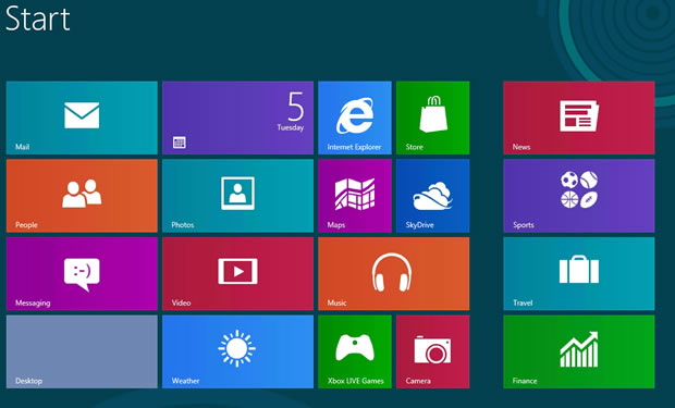
We can start with the obvious. A software menu of some sort. Metro is not a replacement for the start menu, it’s a disgusting pile of “mystery Meat” navigation. No text titles? No options? What is this, Kindergarten? I can read just fine, thank you. Please put a logical list of the software I have at my disposal, so I can decide what I want to run. Or even know what I can run. With Metro, you don’t even know what the machine does.
There are plenty of other things it can’t do, and it’s obvious that Windows 8 is basically a tablet OS, based on desktop code. It doesn’t work well on a desktop at all.
It comes down to TXT.
So why did they do it? Because, on a tablet, it’s actually very slick. Touchscreen PCs are slightly less usable, but who buys those? Microsoft is basically hedging their bets that the traditional desktop PC will go the way of the dinosaurs. The sad thing is, it won’t, at least not any time soon.
I could see keyboards eventually going out of use, once the voice recognition of a PC can accurately dictate your voice in a room of other voices. I could see Xbox Kinect-like PCs using body motions to navigate (well, yeah… like the Xbox) but the technology for text input just isn’t there yet.
Ask any tablet user what’s the most frustrating thing to do on it, and the answer is almost always “typing.” Why? Because touchscreen interfaces just aren’t up to the task, and voice recognition isn’t developed enough to replace it. So today’s Windows 8 is firmly stuck smack in the dead spot of computer evolution. We still communicate by reading and writing, for the most part… even if you post a picture or video, you type a description of it. Even “txt spk” has to be typed, albeit horribly.
So Windows 8 was designed for something that doesn’t exist yet. It’s a desktop OS for a portable machine that isn’t there. Sure, you can buy a high-end tablet that will run it, but you can get a better experience (and better performance) from an OS that was designed for portable devices from the start.
So long, and thanks for all the fish.
Since I have no use for Windows 8 RT on a tablet, and I have 100% more flexibility and usability from free operating systems like Ubuntu Studio on a laptop or desktop, this is where Windows and I finally part ways.
It’s been interesting… since the Windows 3.1 days with floppies and DOS, to Windows 7 which was quirky, but usable… the run has been nice, but it’s over. My Microsoft days are officially over.
At least for me. How about you?


